This project began when the TMRRW Studio approached me, seeking to enhance the presence of their client, Brookfarm. My role was comprehensive, tasked with rejuvenating their brand identity—revamping everything from the logo to an array of visual assets. A central piece of this transformation was the art direction of their main product hero image, ensuring versatility across diverse platforms, from the digital landscape to physical sales displays.
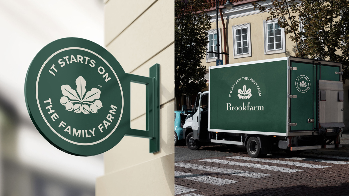
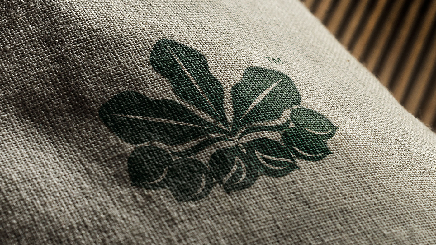
Brookfarm's logo, featuring the distinctive macadamia leaf, is a cornerstone of their identity. Respecting its iconic status, we focused on thoughtful refinements, boosting the existing emblem's strengths. This evolution also introduced a dynamic logo system, offering a suite of variations, including tagline-inclusive lockups, a standalone wordmark, the primary icon, and newly crafted badges.
The visual identity overhaul extended to the foundational elements of the typeface and colour palette. Selecting a typeface family that resonates across digital and physical and recalibrating the colour scheme set the stage for a modern, minimalist graphic system. This new system elevates Brookfarm's products and messaging with its simplicity and versatility, underpinned by a grid layout that adapts seamlessly to any application.
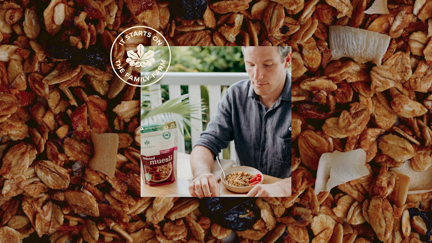
The product hero image was conceptualised to encapsulate the brand's personality. Collaborating with a professional packaging photographer, we brought this vision to life, meticulously guided by the newly established brand parameters.
The end result is a brand reborn: coherent, mature, and communicating with its audience with newfound clarity and precision.